Monday, 31 January 2011

pushing the idea of 'gifting'

pushing the idea of gifts:

i decided to create these milk cartons (that act like a piggy bank jar) that has a common emotion that we feel on a day to day basis on the front in the form of a dictionary definition (ie: happy, sad etc) and on the back where the ingredients are listed there are synonyms of the chosen word on the back.

the idea of this is that it is given to someone as a 'gift' when you are a child and throughout your life to place objects that you relate to the emotion on the front and circle the synonym that you can relate to on the back and eventually pass it to your child to review your life.

the problem with this is the form-milk boxes are often used to package things and i need to find a way to SAY SOMETHING. it is not enticing and encouraging someone to WANT to start this and circulate- it needs to be easily understood.

the color of the boxes relate to the emotion on the front as we tend to associate certain colours with certain emotions and looking at a colour stimulates emotion.


these party/loot bags are based on the same idea and creating something that someone can place their own object based on their feelings/experience or perception of the image.

i created the experimentation on the bag using a personal photograph and overlapping that with some text and mixed media:


the bags:


however the same problem arises here too of how it is to be circulated and how does one know what to do with it as soon as it is received.

need to:
-be more specific about the images
-more directed
-how to encourage people to do this
-where does it end
-what is it resolving


Friday, 28 January 2011

pushing the idea forward

100 different objects by curator of british museum interesting perception on 'special objects'


Curator’s introduction to the 100th object in A History of the World series broadcast on BBC Radio 4. JD Hill, British Museum, explores why this particular object was chosen, and what it can tell us.


barbara kruger famous for her collage and overlapping.
her work creates empathy and does so in a very interesting style.


Thursday, 27 January 2011

feedback

the feedback from the crit was useful to push my idea along, and it was said that my experimentations were working towards more as a gift and gifting someone an experience. so i now need to think of way to create something that can be gifted as opposed to sell, as the objects seem quite personal and as opposed to commercialising it.

-need to create empathy.
-the objects gain VALUE from being circulated so why sell it? -personal vs. selling
-the objects seem quite personal therefore cant VALUE what is being sold. -it never gets devalued because it is personal to you.
-try to create it in a way that is free without wanting anything-allow people to create their own value and perception to the object


Tuesday, 25 January 2011

figuring things out


experimentation to try sell something that is un-sellable:

using emotive text and pairing that with the purpose of the obejct:
ex: 'stir my thoughts' on a drink mixer
'sip my sorrows' on a straw
...etc

this was random and now that i look at it quite funny, using the idea of waxing strips, the peel of the sound of the post-it to represent the sound and concept of waxing strips.

a crinkled piece of paper with an image of a fire and the sound of the crinkled paper represents the sound of the fire.

boxing senses- i think the boxing limits everything and seems to generic.


Monday, 24 January 2011

packaging sells


personal brief 1

Brief title:
Does design aways need an issue behind it for it to be good?

In 3 words what is your brief about?

propaganda, reaction and construction

In one sentence what is your brief about?
Challenging the perception of design

Which key theme/issue/problem is at the centre of your proposal?
Just as art is known to be "art for art sake" I believe design should be just for "design's sake". I believe that design does not have to have a social/political issue behind it for it to be good. I want to find what design gets a response even if its based on being purely visual, I want to create a response.

Which part of the map of graphic design does your brief relate to (fields of interest)?
Visual Merchandising

What are your primary sources of research?
-American Novelties
-Lizzie Finn (handmade dolls for selfridges)
-Lernert and Sanders (selfridges window display)
-'Happy Pills'


happy pills- a sweet twist on packaging
There is nothing we love in this world more than candy. Except maybe good design. Luckily, there's "Happy Pills" - an amazingly cute candy store in Barcelona. Unluckily, there's no people on Earth more annoying than Spaniards. Haha, just kidding. We love everyone. (Except the Spanish.) The store, and all their packaging, is made to resemble a medical facility. Which can also make for quite a cute decorating theme for a Halloween part.

To me this is very appealing, candy is a very normal thing and part of everyday life but the twist with the packaging and branding is very appealing and draws me in. I have been to the shop in barcelona and went crazy of course. But this is my ideal definition of design for design sake and it being done so well visually it does not need an explanation or purpose.


Lernert & Sanders
The launch of Selfridges new shoe department is an exciting prospect for shopaholics, but we didn’t expect it to be quite so exciting for us creative-types. Showing real creative awareness, Selfridges decide to give the fantastic directors Lernert & Sander the freedom to come up with some ideas to promote the new department. I’m not sure what they were expecting, but I’m pretty certain it wasn’t shoes of varying scales made from household products, lovingly built with a wit that is engrained in all the duo do.

These displays are once again very inspiring and they have a purpose but purely to entertain and invite. engage and get a response and to be honest these displays were successful and fully engaged the public, as their launch was very successful. It is work like this that i find purely inspiring and interesting, as it has a no issue behind it besides engaging and gaining maximum response.


American Novelties
Novelties are another example of selling just purely to sell, these items realistically have no purpose and are really wasteful to be honest. Even though they are pointless, but they sell because of the stupidity of the content. It is just the same with packaging, some things that are pointless are successfully sold because of the beautiful packaging.

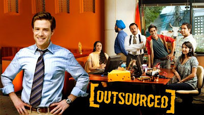
Outsourced is an American Sitcom show set in a Mumbai, India call center, where an American novelties company has recently outsourced its order processing. A lone American manages the call center and must explain American popular culture to his employees as he tries to understand Indian culture.


Sunday, 16 January 2011

final piece


from here i plan to sell this pack of cards as a 'limited edition' valentine gift since valentines day is nearing and will aim to try get some feedback from people to see if the game was successful and whether it worked.

final-ising

i feel that screen printing the backgrounds would have been nice however the symbol does not stand out strong it just seems to merge with the backgrounds which is why i think i will scan in the screen printed background and the place the symbol on top and use that as the final look.

screen printing the backgrounds and the symbol:

on brown paper (the pink comes through clear but the black symbol does not stand out enough)

the dark pink is experimenting the back side of the card on brown paper-the colour does not come through well.
and the white card test works with the background for the front and back of the cards.

screen print on white glossy paper- does not come through well-and the black quote is not visible at all
screen print ad then scanning them in and then placing the symbol on top.


Saturday, 15 January 2011

the box/bag

because of its craft nature and following the theme of 'love' i decided to use this idea of a bag, with visible stitching lines.
i screen printed the heart with the title "forget me not" it again reinforces the idea of memory but also keeps with the love theme.

experiment w/thick ribbon?

experiment w/think string?

no ribbon and just button

however i need to remake this bag, it was just a test, the print is too light and the buttons are not sealing the bag down flat.


i now will...

incorporate a background for the LOVE cards, i will handmake the backgrounds and then i was thinking of screenprinting them in a colour as the backgrounds will give enough depth and texture, and cards are all flat aswell so it fits the nature of playing cards in tact.


there are 15 backgrounds and there will be 15 pairs of cards, i thought that the set pair will share the same background.

placing the symbol directly on top is very flat and also the background is too chaotic and the focus from the symbol and background is split, which is why im thinking of screenprinting the background in one colour and then screenprinting the symbol ontop in a darker colour.

this clearly does NOT work:

so i will screen print the background and then print the symbol.

for the other card, i thought to simply say the origin of the symbol and a quote/proverb relating to the symbol because realistically there should not be much reading in the memory game. however, to connect the pair i will place a smaller version of the symbol on the card so that there is a direct link

like this: (i will screen print these too!)
screen print gives a texture and makes it more personal. final chosen symbols:

font choice: Constantia Regular


final chosen symbols: (ready for screen-printing)


and for the back of all the cards: (im still debating whether to screen-print these or just print it out-il have to try) - just some "cute, lovey" sayings played in the lingo of cards.